

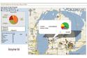
Boyne Resorts: Boyne marketers can click on pushpin icons to learn more about customer behavior, such as the number of visits made to a particular resort and how many nights visitors stayed.


BI projects are frequently driven by the demands of executives who want to scour dashboards to analyze sales and other business trends. But at Boyne Resorts, the company's BI directive was marshaled by its CIO.
In 2007, Chris Downing, who was Boyne's IT chief at the time, asked Noah Meister, then an up-and-coming help desk support person, to take the lead on the company's BI effort. Downing wanted dashboards and various reports that executives in sales, marketing and other business units could sift through to get a better understanding of customer behavior.
It didn't matter that Meister had no BI training or experience at that point in his career. Meister says he was given the BI responsibilities after Downing saw promise in the way he attacked technical and business problems on the help desk.
Meister began by trying to find a better way for the company to generate reports and information for its top decision-makers. Previously, reports were generated strictly by using Business Objects' Crystal Reports, which had its limitations, he says.
"Every time somebody wanted something different from a report, we'd either have to rewrite a report or write an entirely new report," says Meister. Plus, business executives questioned why data in some of the reports didn't always mesh, he adds.
"We wanted to have the same way of reporting information across all of the resorts," says Meister. He evaluated a few open-source BI systems, including SpagoBI and JasperSoft, but he found that it took two to three weeks just to set up each tool and load the data.
In contrast, a test version of Pentaho's BI platform came preloaded with "fake" data, which made it easier "to show management what was possible with the tools," says Meister.
One of the first Pentaho-based reports that Meister put together for Boyne's marketing department utilized a mashup of Google Maps to plot the 50 North American cities that generated the most visitors to the company's resorts over a two-year span. Using the electronic report, which Meister created in February 2007, members of Boyne's marketing team could click on color-coded pushpin icons to learn more about customer behavior at each resort, such as the number of visits and how many nights they stayed. Meister has since assembled other reports that use Pentaho's Google Maps feature, including a visual representation of the types of season passes that ski and water park patrons purchase and where the passes are used.